via: shapes.pl
notatki z życia pisane obrazami [nie zawsze na serio, nie zawsze na żarty]
"For the last two years I (Scott) have been taking still photographs for a personal project entitled 'It's Better In The Wind,' all the while collecting video footage from each ride as we traveled around the Western United States together.
I have been slowly editing the footage into a visual scrapbook of sorts for those who partook, and those who followed us via the web. No preaching the triumphs and failures of the motorcycle industry, no divisive commentary between manufacturers and styles...just a collection of imagery that will hopefully inspire more people to take to the road and discover what there is outside of our respective communities.
Chuck Ragan was kind enough to collaborate with me to write an original soundtrack for the film, to give me some anthemic tunes to edit with, and I can't thank him enough for the kind gesture towards a fellow traveler.
Please, enjoy the film, everybody who took part in it is family, we are all grateful for your support these past two years while we tried to build a concept around the positive nature of motorcycling."
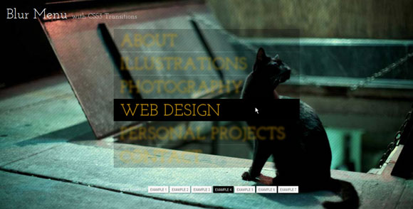
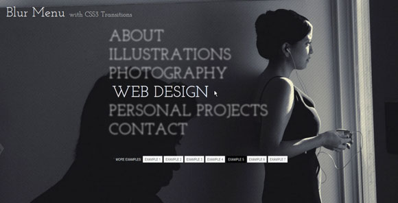
There are so many great things we can do with the additional properties and possibilities that CSS3 brings along. Today I want to show you how to experiment with text shadows and with transitions in order to achieve a blur effect that we’ll apply to a menu on hovering over the elements. The main idea is to blur the other items while enhancing the one we are currently hovering.
The images in the demos are by fabulous Mark Sebastian and they are licensed under the Attribution-ShareAlike 2.0 Generic (CC BY-SA 2.0) License. Visit Mark’s Flickr Photostream or his website to discover some beautiful photography.
Please note that this will only work properly in modern browsers and unfortunately Internet Explorer does not belong to that category yet since it does not support transitions (and many other suggested CSS3 properties that others do support). It also does not support text-shadows, so I’ve added a additional stylesheet for IE which will at least show the menu elements.
Let’s create the HTML structure for our menu first. We’ll add it to a container with a fixed width. The menu is going to look as follows:
<ul class="bmenu">
 <li><a href="#">About</a></li>
 <li><a href="#">Illustrations</a></li>
 <li><a href="#">Photography</a></li>
 <li><a href="#">Web Design</a></li>
 <li><a href="#">Personal Projects</a></li>
 <li><a href="#">Contact</a></li>
</ul>
Now we’ll add some style!
In almost all of our examples we’ll have the same style for the ul and for the list elements. Just the link element will be modified. So, the common style for the unordered list is the following:
.bmenu{
    padding: 0px;
    margin: 0 0 10px 0;
    position: relative;
}
.bmenu li{
    font-size: 50px;
    display: block;
}
Now, let’s take a look at each of the seven examples.
In the first example we want to show the menu items slightly blurred initially. For that, we’ll give the link elements transparent color and a white text-shadow. We’ll also add the transitions for all properties:
.bmenu li a{
 color: transparent;
 display: block;
 text-transform: uppercase;
 text-shadow: 0px 0px 5px #fff;
 letter-spacing: 1px;
 -webkit-transition: all 0.3s ease-in-out;
 -moz-transition: all 0.3s ease-in-out;
 -o-transition: all 0.3s ease-in-out;
 -ms-transition: all 0.3s ease-in-out;
 transition: all 0.3s ease-in-out;
}
When hovering over a link element, we want it to become “clear” and all the others should become blurry. Now, we cannot say “on hover of a particular element do x to all the siblings” in CSS because the sibling selector is not really a sibling selector, it will just give you the next siblings in the HTML.
Anyway, we can do a little trick here. Since we have all our items nicely laid out as block elements, we can simply say, make everything blurry when we hover the whole menu (the unordered list) and then when hovering over a specific item we’ll crisp it up:
.bmenu:hover li a{
 text-shadow: 0px 0px 5px #0d1a3a;
}
.bmenu li a:hover{
 color: #fff;
 text-shadow: 0px 0px 1px #fff;
 padding-left: 10px;
}
By adding a padding left, we’ll animate the currently hovered item a bit to the right.
In the second example, we’ll show the items in the menu a bit skewed initially. We’ll do that with the 2D transforms property skew. The value will be -12 degrees which is the skewing angle along the x axis. The link s will have a semi-transparent background that we’ll achieve by using an rgba value. We’ll also add a slighty transparent text-shadow using rgba:
.bmenu li a{
 display: block;
 text-transform: uppercase;
 text-shadow: 1px 1px 2px rgba(89,22,20,0.3);
 color: #581514;
 padding: 5px 20px;
 margin: 2px;
 background: rgba(255,255,255,0.2);
 letter-spacing: 1px;
 -webkit-transform: skew(-12deg);
 -moz-transform: skew(-12deg);
 -o-transform: skew(-12deg);
 -ms-transform: skew(-12deg);
 transform: skew(-12deg);
 -webkit-transition: all 0.4s ease-in-out;
 -moz-transition: all 0.4s ease-in-out;
 -o-transition: all 0.4s ease-in-out;
 -ms-transition: all 0.4s ease-in-out;
 transition: all 0.4s ease-in-out;
}
Hovering over the menu, we’ll change the skew angle to 0 and make them appear blurry with a semi-transparent background. The currently hovered link will have no background:
.bmenu:hover li a{
 color: transparent;
 text-shadow: 0px 0px 10px #fff;
 background: rgba(88,22,22,0.2);
 -webkit-transform: skew(0deg);
 -moz-transform: skew(0deg);
 -o-transform: skew(0deg);
 -ms-transform: skew(0deg);
 transform: skew(0deg);
}
.bmenu li a:hover{
 background: transparent;
 text-shadow: 1px 1px 10px rgba(89,22,20,0.6);
 color: #581514;
}
In the third example we will play a bit with the sizes of the elements. We’ll initially scale them down and blur them. We’ll use a fairly slow linear transition:
.bmenu li a{
 white-space: nowrap;
 color: transparent;
 display: block;
 text-transform: uppercase;
 text-align: center;
 text-shadow: 0px 0px 6px #fff;
 letter-spacing: 1px;
 -moz-transform: scale(0.5);
 -ms-transform: scale(0.5);
 -o-transform: scale(0.5);
 -webkit-transform: scale(0.5);
 transform: scale(0.5);
 -webkit-transition: all 0.6s linear;
 -moz-transition: all 0.6s linear;
 -o-transition: all 0.6s linear;
 -ms-transition: all 0.6s linear;
 transition: all 0.6s linear;
}
Hovering over the menu, well blur the items even more and the currently hovered element will be sharpened up and scaled to the original size:
.bmenu:hover li a{
 text-shadow: 0px 0px 15px #fff;
}
.bmenu li a:hover{
 text-shadow: 0px 0px 1px #fff;
 -moz-transform: scale(1);
 -ms-transform: scale(1);
 -o-transform: scale(1);
 -webkit-transform: scale(1);
 transform: scale(1);
}

In this variation, we’ll give the link elements a semi-transparent black background and a vibrant orange text color. We’ll use the linear timing transition function here:
.bmenu li a{
 display: block;
 text-transform: uppercase;
 text-shadow: 0px 0px 2px #eeb213;
 color: #eeb213;
 padding: 5px 20px;
 margin: 2px;
 background: rgba(0,0,0,0.7);
 letter-spacing: 1px;
 -webkit-transition: all 0.2s linear;
 -moz-transition: all 0.2s linear;
 -o-transition: all 0.2s linear;
 -ms-transition: all 0.2s linear;
 transition: all 0.2s linear;
}
When we hover, we want the menu items to blur and and also to make their backgrounds more transparent. A single hovered item will become more opaque:
.bmenu:hover li a{
 text-shadow: 0px 0px 10px #eeb213;
 color: transparent;
 background: rgba(0,0,0,0.2);
}
.bmenu li a:hover{
 background: rgba(0,0,0,1.0);
 text-shadow: 0px 0px 1px #eeb213;
}

The fifth example will be a subtle one: we’ll use only white for the text-shadows and font colors and just blur the elements slightly:
.bmenu li a{
 color: transparent;
 display: block;
 text-transform: uppercase;
 text-shadow: 0px 0px 4px #fff;
 letter-spacing: 1px;
 -webkit-transition: all 0.2s ease-in-out;
 -moz-transition: all 0.2s ease-in-out;
 -o-transition: all 0.2s ease-in-out;
 -ms-transition: all 0.2s ease-in-out;
 transition: all 0.2s ease-in-out;
}
On hover we’ll blur a little more and crisp up and move the currently hovered link element a bit:
.bmenu:hover li a{
 text-shadow: 0px 0px 6px #fff;
}
.bmenu li a:hover{
 color: #fff;
 text-shadow: 0px 0px 1px #fff;
 padding-left: 10px;
}

In this example we’ll give the elements a semi-transparent white background and leave them crisp initially:
.bmenu li a{
 white-space: nowrap;
 display: block;
 text-transform: uppercase;
 text-shadow: 1px 1px 2px rgba(71,80,23,0.3);
 color: #fff;
 padding: 5px 20px;
 margin: 2px;
 background: rgba(255,255,255,0.2);
 letter-spacing: 1px;
 -webkit-transition: all 0.4s ease-in-out;
 -moz-transition: all 0.4s ease-in-out;
 -o-transition: all 0.4s ease-in-out;
 -ms-transition: all 0.4s ease-in-out;
 transition: all 0.4s ease-in-out;
}
We want to give the first and last element some rounded borders so that the menu looks like a neat unit. We’ll target our desired elements with the first-child and last-child selectors:
.bmenu li:first-child a{
 -webkit-border-radius: 15px 15px 0px 0px;
 -moz-border-radius: 15px 15px 0px 0px;
 border-radius: 15px 15px 0px 0px;
}
.bmenu li:last-child a{
 -webkit-border-radius: 0px 0px 15px 15px;
 -moz-border-radius: 0px 0px 15px 15px;
 border-radius: 0px 0px 15px 15px;
}
On hover, we want the elements to look blurry and the currently hovered element to change colors and have a transparent background:
.bmenu:hover li a{
 text-shadow: 0px 0px 10px #fff;
 color: transparent;
}
.bmenu li a:hover{
 background: transparent;
 text-shadow: 1px 1px 10px rgba(71,80,23,0.6);
 color: #c4d85a;
}
In the last experiment we’ll make the whole menu look like a circle by adding a border radius with the value of half of the menus width/height:
.bmenu{
 padding: 50px 0px;
 margin: 0 auto;
 position: relative;
 background: rgba(0,0,0,0.7);
 width: 500px;
 height: 400px;
 -webkit-border-radius: 250px;
 -moz-border-radius: 250px;
 border-radius: 250px;
 -webkit-transition: background-color 0.5s ease-in-out;
 -moz-transition: background-color 0.5s ease-in-out;
 -o-transition: background-color 0.5s ease-in-out;
 -ms-transition: background-color 0.5s ease-in-out;
 transition: background-color 0.5s ease-in-out;
}
We’ll add the transitions here because we want to animate the background color when we enter into the menu. We’ll make it more transparent by using rgba values:
.bmenu:hover{
 background: rgba(0,0,0,0.2);
}
We’ll adjust the font size and the line height of the list element a bit:
.bmenu li{
 font-size: 40px;
 display: block;
 line-height: 66px;
}
The elements will be scaled down and blurred:
.bmenu li a{
 white-space: nowrap;
 color: transparent;
 display: block;
 text-align: center;
 text-transform: uppercase;
 text-shadow: 0px 0px 3px #fff;
 letter-spacing: 1px;
 -moz-transform: scale(0.8);
 -ms-transform: scale(0.8);
 -o-transform: scale(0.8);
 -webkit-transform: scale(0.8);
 transform: scale(0.8);
 -webkit-transition: all 0.4s linear;
 -moz-transition: all 0.4s linear;
 -o-transition: all 0.4s linear;
 -ms-transition: all 0.4s linear;
 transition: all 0.4s linear;
}
Hovering over the menu will also make the elements more blurry and give the currently hovered one a nice background color while crisping it up and scaling it to its original size:
.bmenu:hover li a{
 text-shadow: 0px 0px 10px #fff;
}
.bmenu li a:hover{
 text-shadow: none;
 color: #fff;
 background: rgba(129,6,29,0.8);
 -moz-transform: scale(1);
 -ms-transform: scale(1);
 -o-transform: scale(1);
 -webkit-transform: scale(1);
 transform: scale(1);
}
Remember, IE is the party pooper here, but if you’d like to try your luck and use IE’s proprietary shadows, check out the following resources and go wild:
CSS Blurred Text-Shadow in IE — Part I
IE Visual Filters and Transitions Reference: Static Filters
And that’s it! What’s your favorite one? I hope you like these experiments and find them inspiring!
Share and Enjoy:


